Monday, February 20, 2012

Georg Cantor and the foundations of Set Theory.


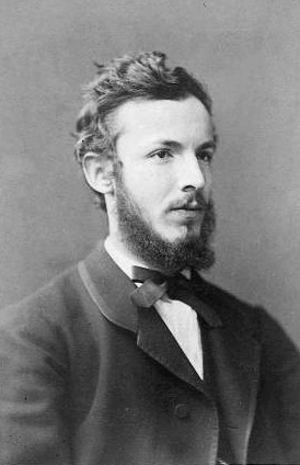
Since I am on the topic of Venn Diagrams, I decided to review the history of "set theory". Given that a Venn Diagram is just a graphical representation of sets of data, producing an accurate Venn Diagram requires understanding the underlying data. While the sets of data presented in Venn Diagrams are normally finite, the whole theory of sets and the interest to mathematicians to develop the theory derived from debates over the possibility of infinity. The German mathematician Georg Cantor created the concept of set theory. Prior to Cantor, mathematicians and philosophers recognized sets of data but only considered they were possible in limited (finite) amounts. Cantor's work proved it is possible to have infinite amounts of data within a set. He also proved that different sets of infinity are not equinumerous. Hence if two sets are presented and they both have infinite data, is is possible that both sets may not have the same amount of data. Part of his proof showed that there are an infinite amount of real numbers and an infinite amount of natural numbers but there are more real numbers than infinite numbers. His proofs were controversial to philosophers of his day, but future mathematicians embraced his work and developed it into the modern concept of set theory. Thus what is normally taught as a beginning skill in statistics, actually has its roots as a topic that changed philosophy and the world view of mathematics.

For deeper information on Georg Cantor, see the Wikipedia article, or read a biography.

MIT OCW Exercise for Ch 1.

I started on the first exercise for the MIT book. Since part of my goal with this class is to produce the answers using GNU R, the time to produce the answer was not very time efficient. I expect time to improve as I progress over the learning curve of the VennDiagram package.

Suppose that A ⊂ B. Show that Bc ⊂ Ac.
The subset is the white area while Ac is both white and yellow areas.


I would like to thanks DWin from StackExchange for his guidance on the VennDiagram package.

Improvements I should consider for this diagram.
  1. Add the label for universal set U (which would equal the area for Bc ).
  2. Fill in the universal set U with a color other than white.
  3. Remove the number values as they are not important for this exercise.
Of course I am open to your comments to improve this diagram.

Monday, February 13, 2012

MIT Open Courseware statistics class, and GNU R

It has been a long time since I performed any serious statistical problems. To update my skills within my own time I am participating in the MIT OpenCourseWare undergraduate level statistics class, but with a twist. I will use GNU R and it's packages for the exercises within the book. I have been using GNU R on and off for my own use. This gives me a better opportunity to build skills with GNU R while strengthening my statistical skills.

So the first chapter in the course book covers Venn diagrams. While simple Venn diagrams are easy to produce, readable complex ones require some skill in art or assistance of a program designed to make them. GNU R seems to have two popular packages to perform this task: VennEuler and VennDiagram.

VennEuler is good for getting started with semi-simple diagrams. You will note that the name mentions both Venn and Euler diagrams. They are similar diagrams whose main difference is how three or more overlapping circles handle area with null data. BMC Bioinformatics posted an example between the two diagrams below.

Note that figure A) (Euler diagram) minimizes overlap show the region that does not share data does not appear. Figure B) (traditional Venn diagram) provides a larger overlap of data but must show a region of zero or null data since the data set does not share any common properties among the three regions.

The GNU R code for a simple Venn diagram below
require(venneuler)
v <- venneuler(c(A=200, B=200, "A&B"=100))
v$labels<- c("Green", "Blue")
plot(v)
text(.5, .6, "my text here")
 
produces the following Venn diagram.
While VennEuler is good for simple Venn diagrams, the package VennDiagram gives the user greater control over the diagrams. Here is an example of a complex Venn diagram from BMC Bioinformatics.
The code for this diagram follows
library(VennDiagram);
venn.diagram(
    x = list(
        I = c(1:60, 61:105, 106:140, 141:160, 166:175, 176:180, 181:205, 206:220),
        IV = c(531:605, 476:530, 336:375, 376:405, 181:205, 206:220, 166:175, 176:180),
        II = c(61:105, 106:140, 181:205, 206:220, 221:285, 286:335, 336:375, 376:405),
        III = c(406:475, 286:335, 106:140, 141:160, 166:175, 181:205, 336:375, 476:530)
        ),
    filename = "1D-quadruple_Venn.tiff",
    col = "black",
    lty = "dotted",
    lwd = 4,
    fill = c("cornflowerblue", "green", "yellow", "darkorchid1"),
    alpha = 0.50,
    label.col = c("orange", "white", "darkorchid4", "white", "white", "white", "white", "white", "darkblue", "white", "white", "white", "white", "darkgreen", "white"),
    cex = 2.5,
    fontfamily = "serif",
    fontface = "bold",
    cat.col = c("darkblue", "darkgreen", "orange", "darkorchid4"),
    cat.cex = 2.5,
    cat.fontfamily = "serif"
    );


Reviewing the sample code and the available documentation for both packages, the VennDiagram package contains a larger library of statements for granular control of the diagram. As I perform the exercises in the statistics book, I will attempt a mix of diagrams from each package and provide examples of what I learned from the chapter and from the use of both GNU R packages.